
10 Website UX Features that Improve Online Traffic, Leads & Sales
Online shopping behavior has a direct correlation with the visual engagement of an e-commerce website, i.e. the User Experience (UX). There are thousands of sites selling products and services online. But only a few succeed in effective branding and continued traffic flow. Sites that delight customers with interesting and action-driven elements create lasting impact. A bad design and poor user interface, on the contrary, can lead to the loss of businesses – even if you have great products to offer at affordable prices.
The correlation between UX and user flow works on AIDA (A=Attention, I=Interest, D=Desire, A=Action) model. A user interface that follows AIDA principles in its navigational features, is more likely to convert users into sales leads.
UX design plays a key role in defining marketing strategies and selling avenues for business owners. Many successful e-commerce sites have played their cards and been able to maintain their creditworthiness. Amazon.com, Flipkart.com, eBay.in, AO.com, and Argos.com are a few examples of successful experimenters.
In this article, we will see 10 UX features of certain leading e-commerce sites and learn what different they do that others are missing. The UX features of the sites are assorted as per their placements on different pages or sections such as Homepage, Product listing page, Product details page, Cart or Basket section or Product checkout page.
Here are 10 E-commerce UX Features that Improve Online Traffic & Sales
1. Amazon.com – Free Shipping Banner in Header and Slider Content
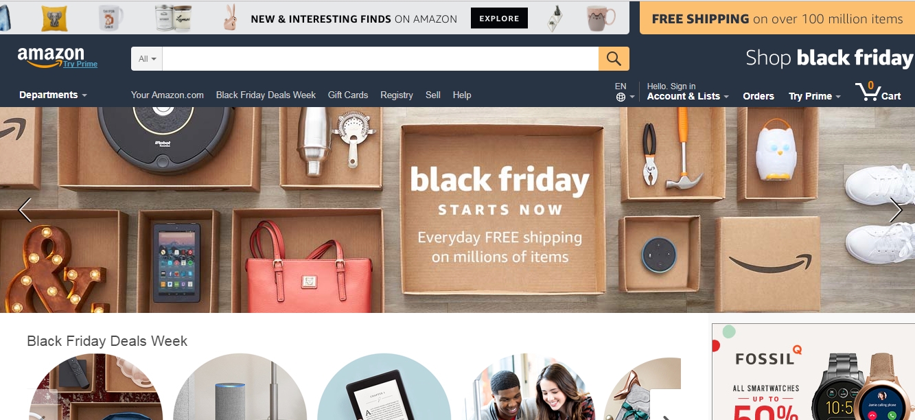
Amazon uses a strip header banner which tells the users about what is so special for them today and why that so. It creates a lasting impact on users’ mind as they find a quick reason to browse from the list of wish items. For example, customers know that it is a Black Friday, a special occasion, and there are endless opportunities to grab interesting offer including shipping free of cost. Such eventful offers boost sales conversions.
2. Bestbuy.com – Opening Hours of Local Stores in Header
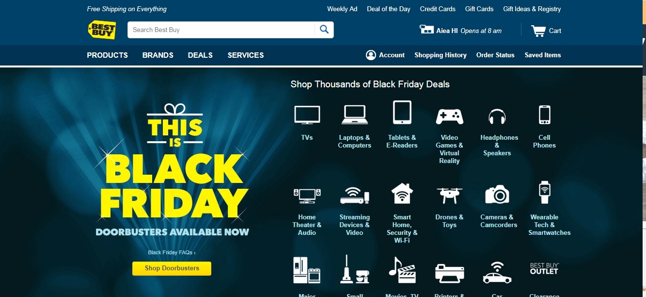
Best Buy displays a store icon in the header that shows store location and the hour of opening for the day. This helps buyers know their nearest store location and decide on their purchasing hour and choice. They can even check the list of products on a deal on a particular day and store location.
3. eBay.com – Seasonal Offer as per Product Category on Home Page
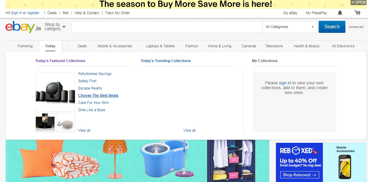
eBay highlights their products offering as per the product categories. Buyers can quickly navigate through today’s featured and trending collections by product type and then select a preferred item of their choice. This helps them decide faster on what kind of products to look into in today’s deal. Buyers can scroll down the page and explore the photos of the same products by a group. The user interface and color theme (white and grey base) of eBay’s home page look clean, elegant, and distraction-free.
4. Booking.com – Sticky Search Bar on the Home Page
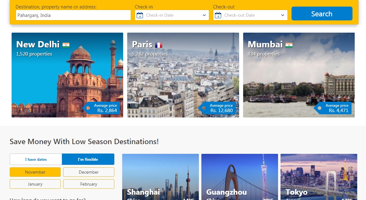
Booking.com – a leading online travel agent makes the search super easy when buyers want a quick and effortless booking. You can simply select any of the search categories such as hotels, flights, trains, buses, rental cars, and airport taxis from the top menu on the home page and then enter your details in the onsite search bar. That’s it. For example, while looking for a hotel, in the sticky search bar, you can add destination, property name or address and then mention check-in and the check-out date to find a list of hotels for your choice. Good usability and quick search navigation features of an ecommerce portal drive a user to reach their goals faster. This results in high retention and repeated visits.
5. Checkintocash.com – Above the Fold Call-To-Action Button for Two Different Target Audiences
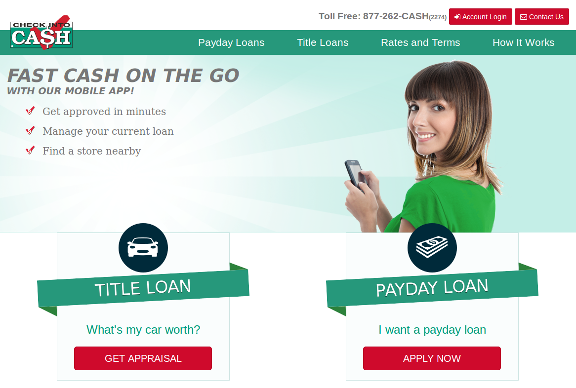
For Check Into Cash website, two call-to-action buttons have been placed in the home page to get their quick leads. It improves the performance of their lead capture. As the buttons have been placed above the fold of the website, these are visible to every new and returned visitors. As these buttons are for generating leads on two different target audiences, it is quite easy for the visitors to get a quick access from home page.
6. Argos.co.uk – Same-Day Delivery Products in Faceted Navigation
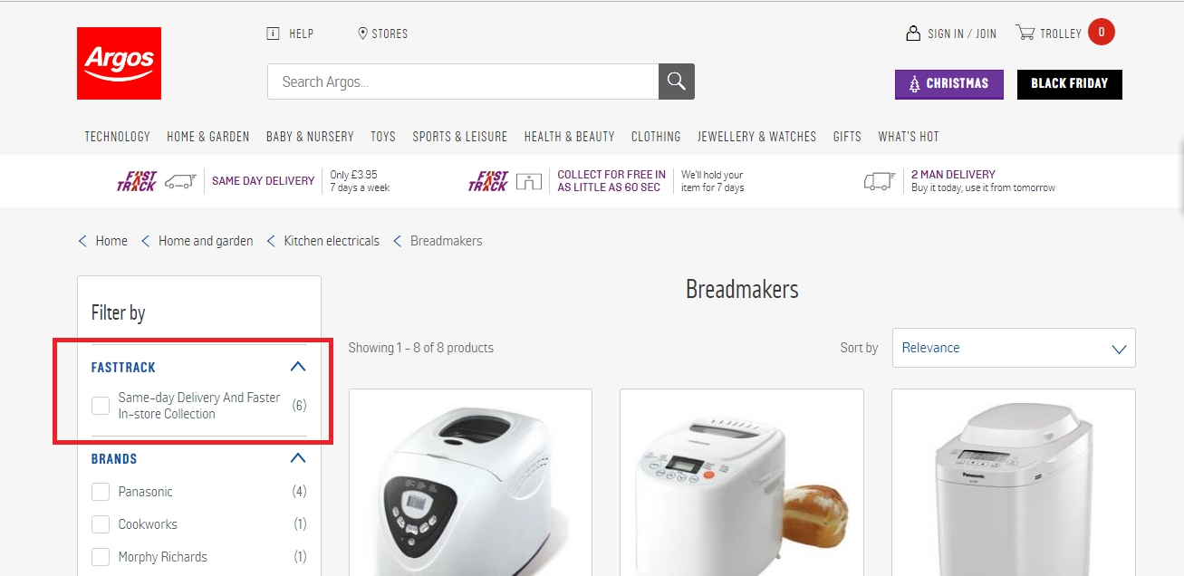
It couldn’t have been easier! Buyers who need same-day delivery can directly filter their search even before going into the details of a product. The faceted navigation or faceted search allows a user to select from only faster-in-store collections. which is really time-saving. Faceted navigation is one of most important aspects for On Page optimization of ecommoerce website.
7. Rentalcars.com – Secret Deal and Save for Later Option
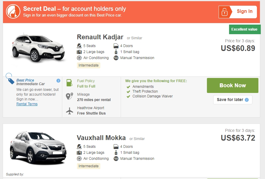
Rentalcars allows users to grab the best price deals and save them as a reference for later use. Users can log in to the portal and complete the purchase cycle at their convenience. This gives flexibility and freedom of choosing items from many and saving them to the wish lists for reconsideration.
8. Flipkart.com – Maximized Product View from Different Angles
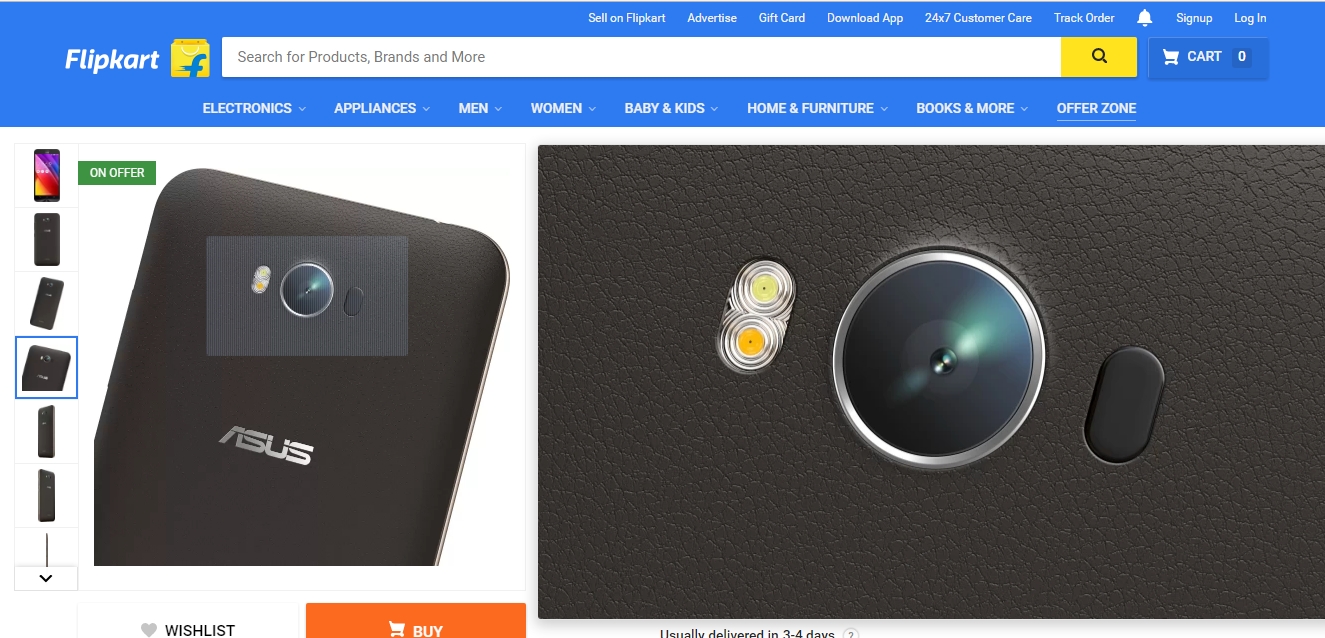
It takes you closer to a product that you wish to buy. With a zoomed view of the product from different sides, buyers can better check the color, length, breadth, pattern of texture and other specifications in detail before ordering the product. This gains confidence in buyer’s mind which results in successful checkout.
9. ASOS.com – Interactive Size Guide Tool
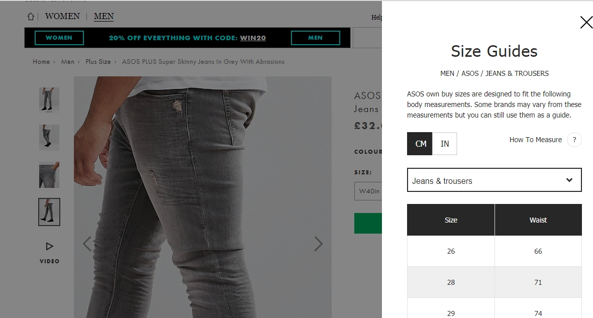
Many e-commerce retailers don’t provide the option to customize your search for clothes based on buyers’ height, weight, and tightness. ASOS follows the same strategy so that you can spend quality time browsing the right product on the site and don’t end up returning it or exchanging it with the store. Buyers can pick any size by combining measurement of the “Jeans and Trousers” and the “Inside leg” options available in the e-store. The size guide makes the selection task easier and quicker.
10. AO.com – Delivery Time and Process Assurance on Check out Page
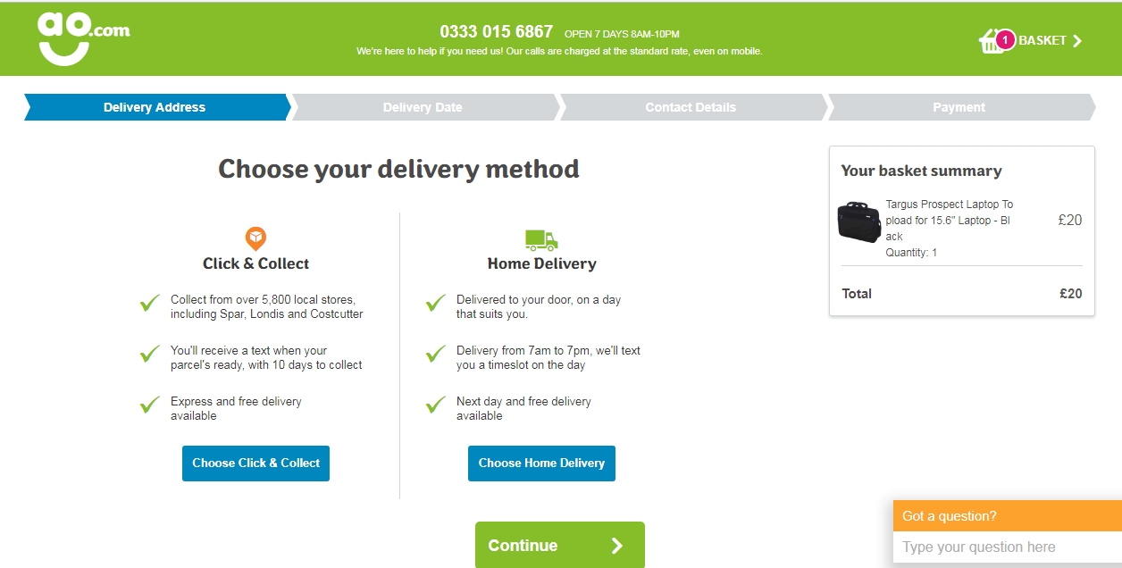
AO.com ensures that the buyers are not left with any question regarding delivery mode and contact details of the helpline, if required. Buyers know when they are supposed to get delivery SMS, delivery phone call, and other tracking information so they don’t have to stay or wait all the day to receive the parcel.
More Lessons on Proven UX features
Improving UI of an e-commerce portal is a scientific process, not just a mere marketing or advertising strategy. Following a few tricks can help:
- Work on the “Search box”. Most of the buyers use it. Monitor for what kind of searches there is no product in your catalog. Customize your landing page in such a way that does not depress a user when unable to find a product on your site.
- Add “Compare” feature to all the products across all the categories. Buyers tend to compare items to ensure the best value for their prices. “Compare” option helps buyers narrow down their search for the best and thus an early checkout.
- Use easy-to-scan titles for the products. Long titles including brand name, type and product specs don’t help visitors scan a product. They have to mentally break it down into small components to process necessary information. This is not a viable option.
- Give customized experience to the visitors. The e-shop should not look like a normal, dull page containing a bunch of products for selling. Add graphics and gif animations to the product details page that can explain how to use the product or how it is made of or how to maintain it. All these interactive and personalized experience add value to an e-commerce store.
- Add high definition images of products that have clear close-ups. Research says that products having relevant high-quality images tend to get more views, meaning one step down to the sales funnel.
Final words
It’s your website, so you often end up with biased thoughts when trying to improve UX features. It is suggested that you should disconnect yourself from your site for some hours and then take a fresh look at it as if you are a buyer. Concentrate on the features that help you perform the entire buying process smoothly. Ask yourself how accessible, intuitive and trustworthy your e-commerce store is and what more you want to add. Browsing competitors’ sites can help in collecting some ideas. You can also integrate Google Analytics tracking code to your site and track lead conversion statistics on a periodical basis. The predictive analysis report helps define the scope of improvement in UI/UX design.

- Eye-Catching Thumbnails: A Powerful YouTube Channel Growth Tool - November 26, 2023
- Unlocking the Tech Trick: How to Create Gmail and Google Voice Without a Number - October 21, 2023
- Unveiling the Intriguing Journey of eUniverse in Shaping an Early Metaverse-Like Experience Amidst Cyber Challenges - September 23, 2023
Related Posts


About The Author
Debarup
Hi friends, This is Debarup Mukherjee, a Digital Marketing Specialist, SEO Consultant & Blogger. I have over 12 years experience in Digital Marketing. I love to write on technology and SEO. I have built many blogs, one of them is Techno World News, specially for Technology & Internet. Hope everyone like and enjoy this blog and get valuable information which you can share with your friends. You can ask me anything on my Twitter, Facebook or Google+ Account