
4 Pillars of the Most Effective Mobile Typography
In the age of Smartphones and Tablets, your website will suffer a major hit if it’s not mobile-ready. Leave aside a website, people nowadays prefer to read e-books a lot more than the physical ones. Standing at the brink of a paradigm shift where mobile Internet usage is ready to overtake desktop Internet usage, it is pretty clear that there is absolutely no way for you to ignore mobile typography.
The design, development and user-friendly navigation of a website are crucial factors that determine its success. But above all, it is the content that hooks in potential customers. And if they can’t figure out what they are reading through their mobile devices, your website is as good as dead.
It is time to follow the rules and stop with the experiments. Let the pillars of mobile typography guide you into creating the most lucid yet stylish content for your website.
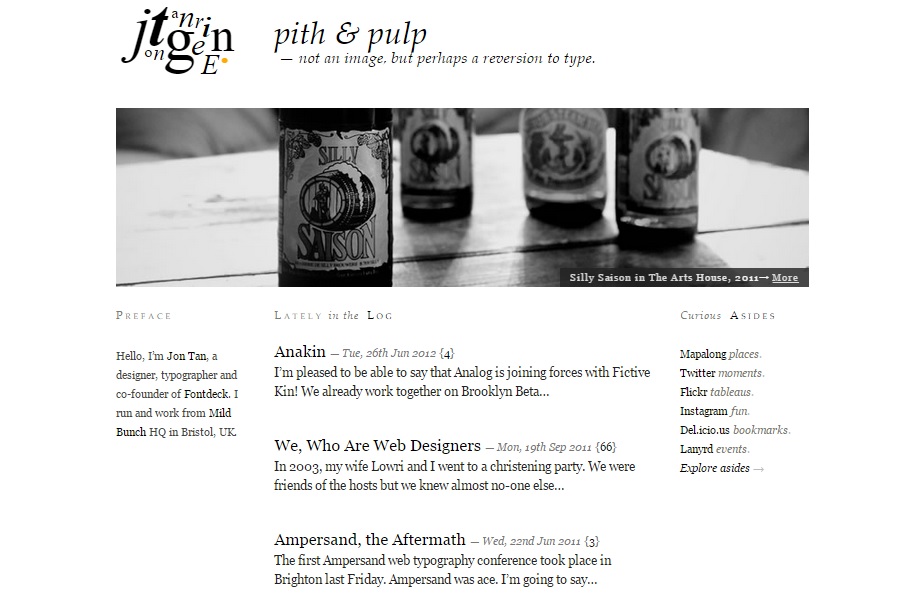
Pillar No.1: ‘The Space’
 [www.jontangerine.com]
Broadly speaking, typography has never been about the fonts or the arrangement of lines. It has more to do with the space within and around them, especially the spaces between letters or words.
When it comes to mobile typography, the basic rule has not changed since the days of the first printing presses. The space between letters should always be lesser than the space between words; the space between words should be lesser than the space between lines; and the space between lines should be lesser than the space between paragraphs.
Along with the space, there is also a need to maintain a proper typographical hierarchy. From the <h1> tag to the <h6> tag, there should be a steady flow guiding the reader all the time.
Pillar No.2: ‘The Measure’
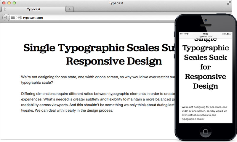 [www.typecast.com]
The ‘Measure’ is the ideal length of a text line to make it fit perfectly into the browser. Unknown to many designers and developers, the copybook length of a line to make it perfectly readable on desktop screens is 65 characters. However, we are not talking about a much smaller device.
When it comes to mobile screens, it is natural that one has to shrink the limit of 65 characters. Only the narrow columns of the body text is ideally supposed to be between 35 and 38 characters. So when you are playing with the bold titles or sub-titles, it is evident to take the measurements further low. The exact number depends on the text itself… and therefore, you have to run a test to determine what fits you best.
Pillar No.3: ‘The Rag’
 [www.montylounge.com]
We read most languages from left to right (except a selected few, like Japanese and Arabic). That’s the rule, right? So when you are working on the content for a mobile screen, make sure the ‘Rag’ is always on the right.
But what is ‘Rag’? You have seen it a million times, but haven’t understood the psychology behind it. It is actually about the text alignment where there is an even left side and an uneven (or ragged) right side of a text row. Especially when the screen is smaller, make sure you follow this traditional rule as it’s easier for an eye to jump from the end of one line to the beginning on the next if it knows where to land every time… thus, making the reader comprehend the pattern and read fluently.
So even if there are parallel rows of texts just like in the picture above, make sure that every row has an even left side with the ‘Rag’ on the right.
Pillar No.4: ‘The Contrast’
 [www.webdesignerdepot.com]
Although extremely necessary, I am definitely not talking about adjusting the contrast between the background and the text body. Here, ‘Contrast’ actually refers to adjusting the different levels of type.
For a desktop screen, it is easier to use titles and sub-titles that are 3 times larger than the body text. A mobile screen doesn’t get the same privilege as less amount of text is visible on a single line. In order to keep a balance between the headings and the body (as shown in the picture above) in both desktop and mobile screens, one has to tighten the ratios to lower the contrast between the two layouts.
When it comes to a desktop screen, one has to increase size by multiplying with 1.618. Naturally for a smaller screen, the proportion to multiply with is also smaller – 1.382. But nothing is ideally fixed. So keep things closer to these figures and run a test to see the results.
Conclusion
Take one leg out of a table from the four, and the table is useless. You have a similar case in hand where mobile typography is your table and these four guidelines are the legs (or pillars, like I said). Therefore, make sure everything is at its perfect to make the content of an entire website look super cool.
- 4 Pillars of the Most Effective Mobile Typography - February 28, 2015
- Marketing 101: What makes People Click on an Email Newsletter? - February 25, 2015
User Review
( votes)Related Posts


About The Author
Agnipravo Sengupta
Agnipravo Sengupta is an enthusiastic content writer and curator. Apart from staying attuned with Web Design, SEO, Social Media and everything marketing, he takes delight in trying out adventure sports & playing video games. Follow him on Google+ and Twitter.