
From Ordinary to Extraordinary: What Makes a Web Page Stand Out?
If 15 seconds is all we have to capture the attention of the target audience, then your website should be ready to win them over with instant impact.
Landing pages do not generally come with any fixed set of techniques or rules. According to Hubspot, a single landing page can generate as much as 5 to 15 percent conversion rate. So, how can you take your landing pages from good to great?
You can spend countless hours on trying to achieve the perfect landing page design, but the bar continues to rise higher as web designers keep experimenting with new designs and development strategies.
Many designers research their competition’s design before starting a new project. You too can study your competitors to keep track on things that you would otherwise miss out.
Hence, a detailed comparison of some of the most beautiful (and successful) landing pages can help us understand how they differ from an ordinary landing page layout.
What turns a landing page from ordinary to extraordinary?
Almost every website has an example to share, but I picked out a select few to make a detailed analysis.
Note: Before you get down to read the analysis, take a few minutes to look at each landing page. Study them carefully and ask yourself: what do you like about it? This way, you can understand better which elements make you want to convert.
#1. Manpacks vs. Harry’s Blades
For some reason, the thought of checking out men’s essentials cropped up in my mind. So I searched for “Shaving Blades” on Google. The two landing pages that I chose out of the many results that showed up, are both retail sites, aimed to take care of the essential things that men need.
Manpacks vs. Harry’s Score: I love the overall design by Manpacks, but when compared with the landing page of Harry’s product page, Harry’s wins a score.
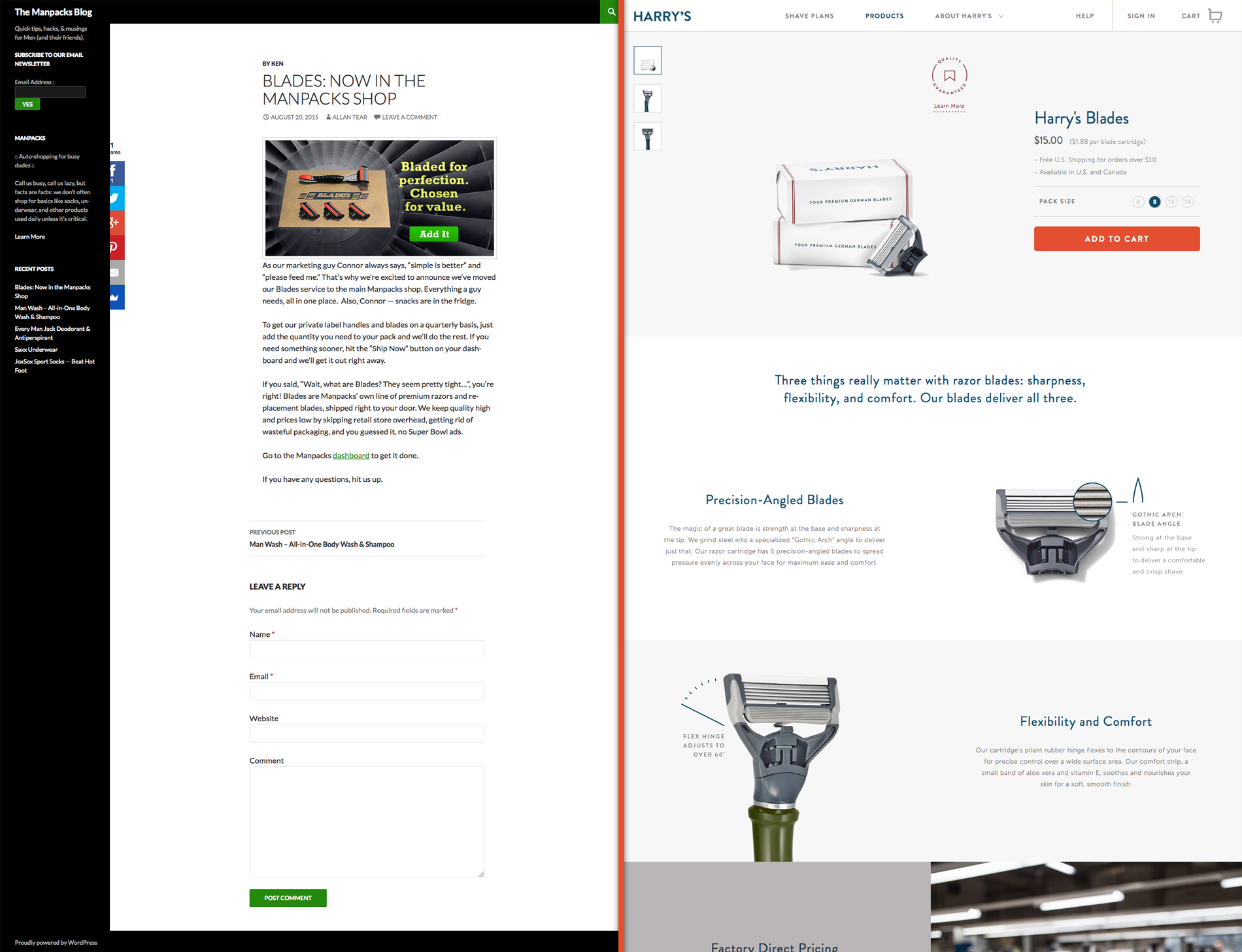
To begin with, both the landing pages have their individual Call To Action on the upper fold. Manpacks has a nice one liner – “Bladed for perfection. Chosen for value.” and a product picture, followed by the CTA button. Harry’s gives out a little bit more information, along with the product image and the price, the pack size and a ‘Learn more’ option that provides unsatisfied customers with the facility to return a product within 30 days from the date of purchase.
Harry’s also has a tagline, but that comes after the CTA . The copy conveys the same message as Manpacks, but has more clarity. In other words, the website conveys out the essence properly to make the viewers feel it.
Harry’s tagline hits it right on with the following words, “Three things really matter with razor blades: sharpness, flexibility, and comfort. Our blades deliver all three.”
Let’s scroll below and look at the lower fold now. Going down, Manpacks provides viewers with a chunk of copy to read. This comes in a blog page style but Manpacks provides a comment section, where people can post their opinions and which looks more or less like a testimonial section.
According to web design basics, keep the copy of your web page smart, short and compact so that the reader can get to the point easily and quickly. That does not mean you should forget about creativity. As I scrolled Harry’s page further down, I discovered a detailed description of the features of the product along with high-resolution images.
Both the pages have a white color background, but Harry’s page adds a touch of gray to neutralize the whiteness, which would otherwise have made it look a little bit of too much.
#2. Aarna Systems vs. B3NET
Never forget to include your Call To Action. Or else, why would you even care to invest your money, energy and time on building a landing page in the first place. There seems something wrong with the design layout when you enter the pages of both Aarna Systems and B3NET.
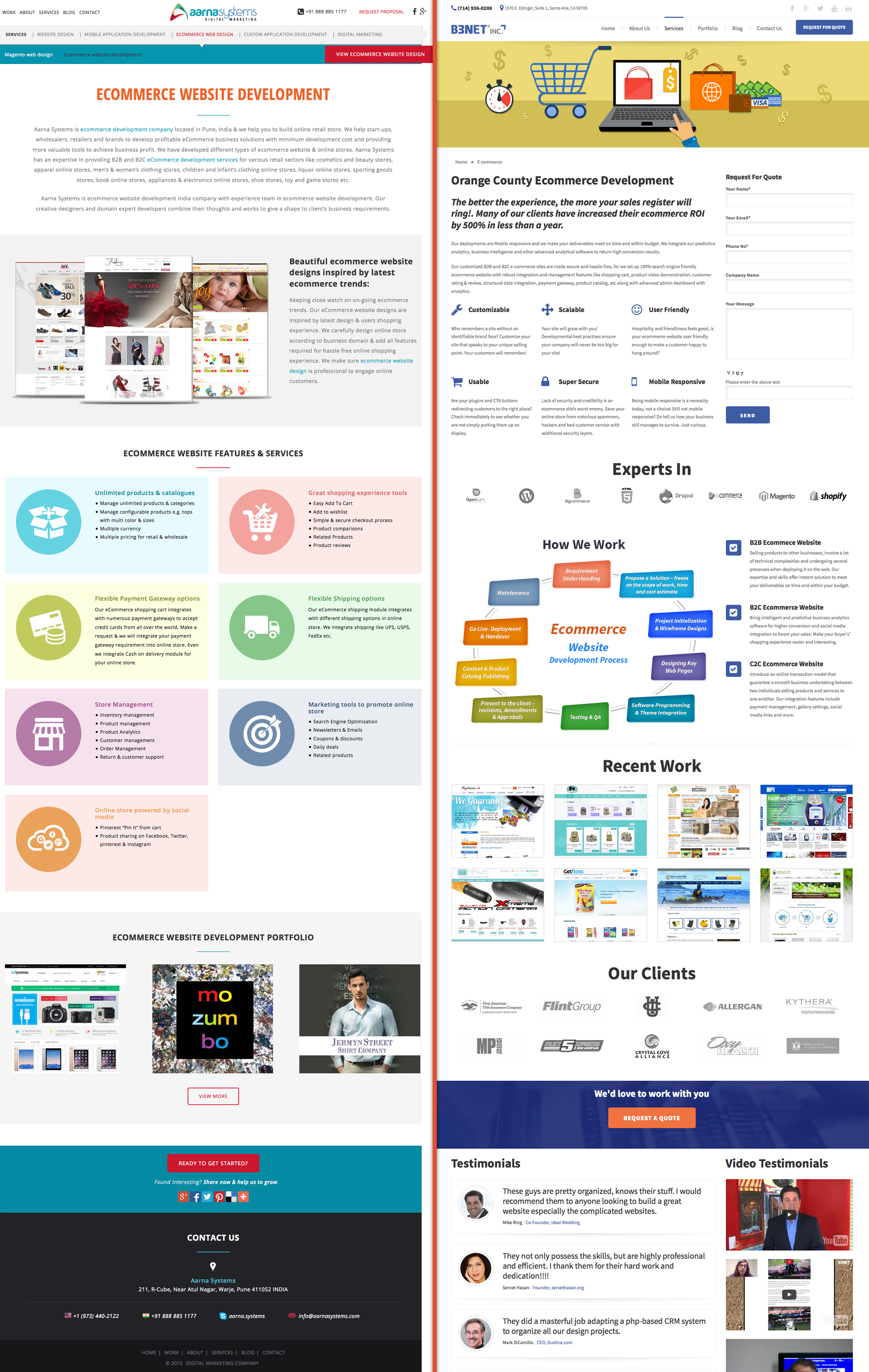
Aarna Systems vs. B3NET: Which one had the flaw? The landing page of Aarna Systems ofcourse.
Besides, going by your plan to create a layout design, how would you want to fit in all the elements within the page? Bring the user attention down the conversion funnel with elements like ‘What’ and ‘How’.
What? – What does your landing page have to talk about?
How? – How would you approach customers with your service?
Therefore, keep the introduction and the CTA on the upper fold. Aarna Systems e-commerce page greets us with a chunk of copy that spans across 30% of the web page, followed by the other 40 percent covering the features and services and the remaining 30% containing a portfolio showcase and a Call To Action.
In B3NET’s e-commerce landing page, 30% of the area in the upper fold comes occupied by an introduction, the benefits and the CTA. Scrolling further down, the other 30% includes information such as their expertise, workflow and portfolio.
Usage of icons for the expertise section makes the services easily identifiable at one glance. Breaking down the copy enables readers to stay focused without having to wander off to some other segment. A detailed description of the work process itself sounds boring. B3NET utilizes visual imagery to convey the necessary information conveniently.
Apart from this, B3NET once again uses icons to showcase the long list of their clients.
Testimonial sounds great, but honestly speaking it might seem too biased, causing people to overlook instead.
After this, the next 10 percent provide viewers with another Call To Action. Lengthy pages may cause one’s attention to wander off, ultimately causing the client to forget all about the proposed action. Providing an additional CTA brings the viewer right back to the point. It’s not that B3NET has completely thrown away the utility of testimonials.
The next thirty percent includes the testimonials along with an ‘About Us’, ‘Local Service Pages’, ‘Contact’ and ‘Quick Links’.
In short, B3NET brings a landing page that includes everything within a clean and compact layout.
#3. Travel and Leisure vs. Fodors
For my next comparison, I decided to pick up a different genre and this time I chose travel as the subject.
Travel and Leisure vs. Fodors: Fodors looks more organized and clear as a travel guide page.
It breaks down the content to highlight only the important things and places a CTA button in the upper fold, on the right side. The landing page design looks simple and informative. Atleast, when visitors reach the page, they would know exactly what to do and where to go next.
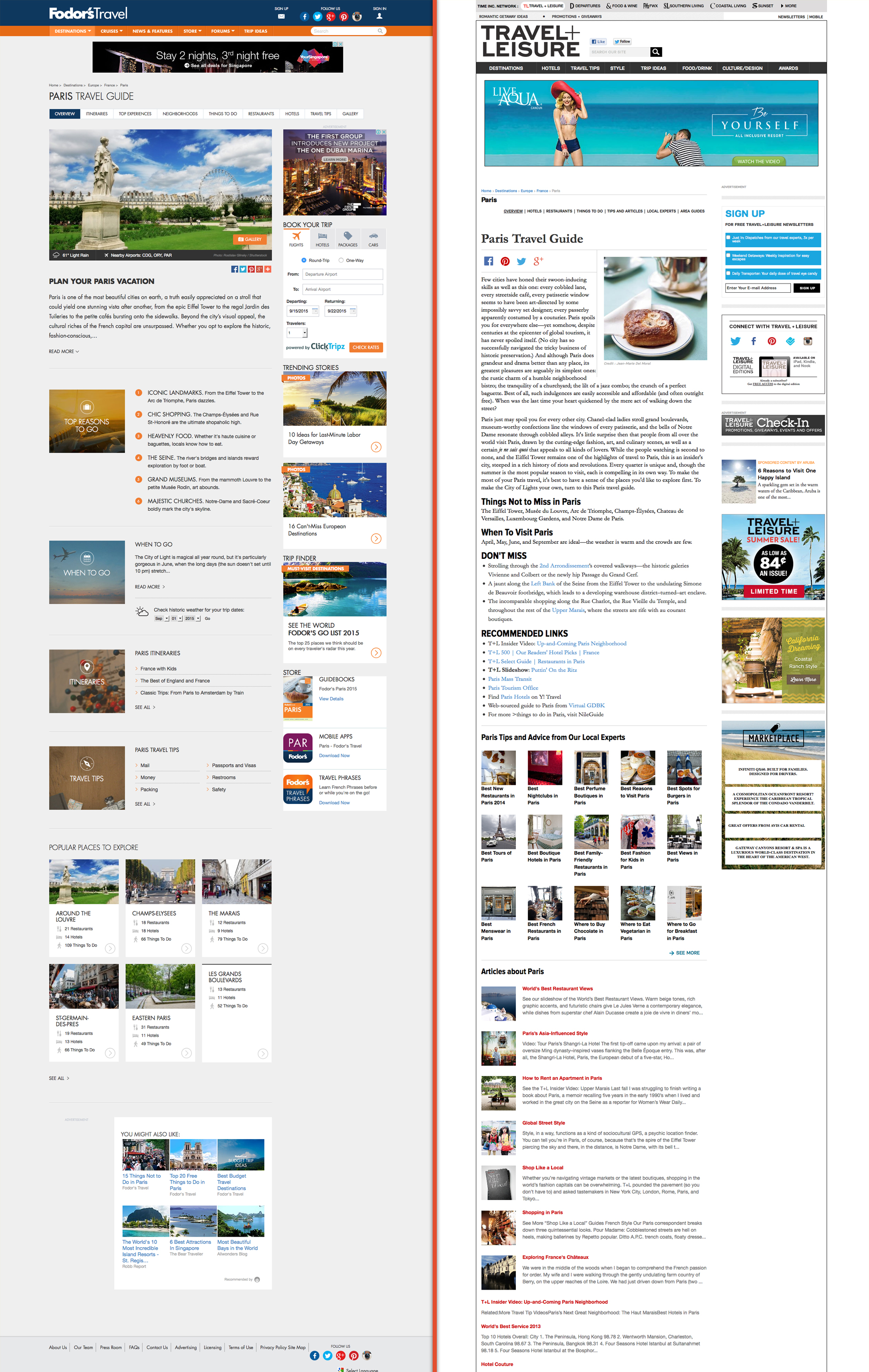
Travel and Leisure, on the other hand, appears way too wordy and might need some help with the structural framework. The CTA button for sign-up appears on the right side, but anyone planning to make the trip would have found it more convenient, had there been a CTA button to book trips just like the Fodors.
There are travelers traveling for the first time. So making your landing page convenient with the right CTA can provide them the user experience they already anticipate from your page.
Conclusion
Placing the elements at the right place for the right audience can turn a good landing page into great. Learning how to design a landing page that converts need some understanding and observation.
Have you read this? Now go on and try analyzing a few more landing pages yourself. Compare them just like I did. It takes some time, but you would eventually learn how to optimize your own web landing page.
- Do’s and Don’ts of Mobile App Marketing via Social Media - March 30, 2019
- 8 Digital Marketing Trends in 2019 You Should Follow - February 6, 2019
- Voice Search Optimization: Tips for Your Creative Content Marketing Plan - July 30, 2018
Related Posts


About The Author
Sarah Clark
Sarah Clark, working in B3NET Inc. & Mobixed as Content Developer. B3NET is leading web design & web development company from Orange County, California, Search Optimal is the Internet Marketing division of it. Sarah is working in web, mobile & Internet marketing domain with her 8 years of experience.