
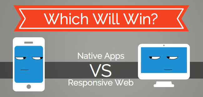
Choosing Between Responsive Website and Mobile App – A major Dilemma
Just when you might have been wondering whether your favorite brick and mortar shopping centers would soon become obsolete, here is another big buzz that’s set to once more pull down the shutters on another online trend. Speaking of which, how many of you still prefer to shop online from a browser? Or has mobile shopping from an app become a more comfortable convenience? The answer we both know and it is not big a surprise that being mobile friendly is the hottest topic of discussion among entrepreneurs now, where the core dilemma duals on whether to invest on a responsive website or a mobile app.
It is difficult to choose between the two, since both have their individual advantages and disadvantages, and businesses using both know they hold a better chance to excel in the market. Nevertheless, some of you might have limited budget to invest and hence find it a tough call to decide which one to go for. Always follow the goals of your company before you decide to invest on something. Would your company benefit anything? What made you take the decision in the first place? Does your existing client data coming from mobile devices show more interaction than those coming from the desktop version? Learning your visitor and customer behavior data is very important, for they give you the necessary cue you need, to think over your marketing strategy. Big e-commerce companies like Myntra and Flipkart have already considered shutting down their mobile website in favor of mobile apps.
That is because, Myntra generates more than 90% of its online traffic and 70% of its revenue from mobile applications. Flipkart, reported to generate more than 75% of its traffic, now aims to go for a fully optimized mobile app website. Sounds logical enough!
But are you still pessimistic enough to take your call to action? Then let’s talk a little bit more on this shall we?
Mobile App Or Responsive Web Design: Factors To Influence Your Decision
Understanding The Specifics Of Individual User Experience
A Responsive web design is kind of one layout designed to fit all mobile devices. It is affordable compared to the development of a mobile app and is cost effective given that you have to invest only once.
If you are only concerned about generating more traffic, then a responsive design is the right choice to opt for. The user has to go to the browser first in order to access the website, but they come with a better browsing speed, which is universal for any device you browse from. That means your content can be accessed faster than an app and it is good in the eyes of the search engine bots. A mobile app on the other hand, is designed for a specific operating system it lives on. This means, users who own that particular operating system device are only liable to enjoy an exclusive user experience. It is a costly investment given that you have to design OS specific apps for different targets in the market, nevertheless unlike a responsive design, an app brings users a unique mobile experience such as incorporating smartphone features like the GPS or the camera.
Responsive web designs are faster to create and execute, compared to mobile apps that generally require pre approval from an app store and has to abide by the extensive guidelines prior to an app launch.
Investing on a responsive design is better than not being mobile friendly. However, given that every website is now trying to set up their unique brand identity, a mobile app turns out to be comparatively more interactive and personalized – elements necessary to generate an engaging communication.
The Behavior Of The Current Market Scenario
As mentioned above, you need to take into account the data and statistics of the current market scenario in order to weigh the pros and cons that influence your power of decision. Based on the latest market analysis, out of 56 million people, 65% of the impression generated would be from mobile devices while 35% would be from mobile apps. Nevertheless on an average, the number of impressions a brand can generate from a mobile app is 2.4 times more when compared to a responsive design.
Stop Worrying And Start Making Your Existing Website Mobile App Friendly
Begin by analyzing your existing data to study which operating system is used the most to access your website. This is where your Google Analytics tool comes to play. When designing your business app, make sure your application includes all the essential features that match your operating system platform. This would help you to create a personalized experience for the user by gathering data regarding their online activities and habits such as, whether he/she is an avid music lover or a shopaholic, etc.
While being responsive might make your website mobile search friendly, there are still certain limitations that make it difficult to parse HTML5 on the mobile device. Users might begin to suffer as website design progresses to become more complex, which however gets eliminated with a mobile app. So stop worrying and start letting them enjoy a mobile app friendly version of your website. However, at the end of the day it all depends on how you can relate your business goals to determine which mobile version to pick.
- Do’s and Don’ts of Mobile App Marketing via Social Media - March 30, 2019
- 8 Digital Marketing Trends in 2019 You Should Follow - February 6, 2019
- Voice Search Optimization: Tips for Your Creative Content Marketing Plan - July 30, 2018
Related Posts


About The Author
Sarah Clark
Sarah Clark, working in B3NET Inc. & Mobixed as Content Developer. B3NET is leading web design & web development company from Orange County, California, Search Optimal is the Internet Marketing division of it. Sarah is working in web, mobile & Internet marketing domain with her 8 years of experience.