5 Web Design Tips to Make Author’s Website More Engaging
Sometimes, designing a website for a publisher or for an author might seem to be the hardest task ever for a web designer. There are a lot of factors that one needs to keep in mind when designing an e-publishing web page – like providing key information about a particular book in order to target potential readers and book sellers alike and to generate constant promotional leads that might help authors to earn more fans and increase their number of sales.
Designing a book related website is tricky in the sense; an author can have a long list of work to showcase that would make the web page to be ‘lacking space’. On the other hand, it could be an amateur author who have just started out new on his/her professional journey with not more than two or three books. Then that could turn out to be a major challenge for the web designer to fill in the extra empty spaces. Well, be it a publisher’s website or an author’s website, the mantra is universal for every web design – to make it engaging and interactive.
A successful book publication site web design needs to keep the aesthetic mood neutral throughout, so that publishers and authors could showcase their books without having to compete with them. It should make a reader feel interested to check out the latest collection of stock and prove to booksellers why they should pile up their stock with your books. Unfortunately, not many author or publisher websites tend to follow this principle in their web design.
Having said that, web designers are becoming savvier than ever before, in their strategies to reach out to their target audience. Let’s break down some of the basic simple design techniques that web designers might think of implementing in their web design for better engagement.
#1 – Clear Presentation and Easy Navigation
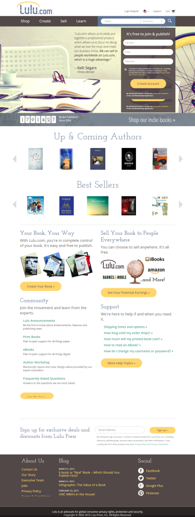
If you have a book that is set out to be published or has been already published, then use it to capture you visitor’s attention on the home page. Use the front book cover art (you might include the centre part of the book) for demonstration on the home page. People visiting you website will instantly get the idea that your site is a book related website. On the other hand, visitors who are already acquainted with your works will instantly get the information in advance of your new book launch.
Make a loud and clear presentation of it. You might display a 3d shot of the book and link it up with a short intro text or add a link up page to it so that people can easily teleport to a separate landing page that you have set up for customers to take the purchase call-to-action. This is easy navigation. In this way, you are not only making a clear demonstration of your latest work but also pointing out the place from where they can download an e-book or make an online purchase.
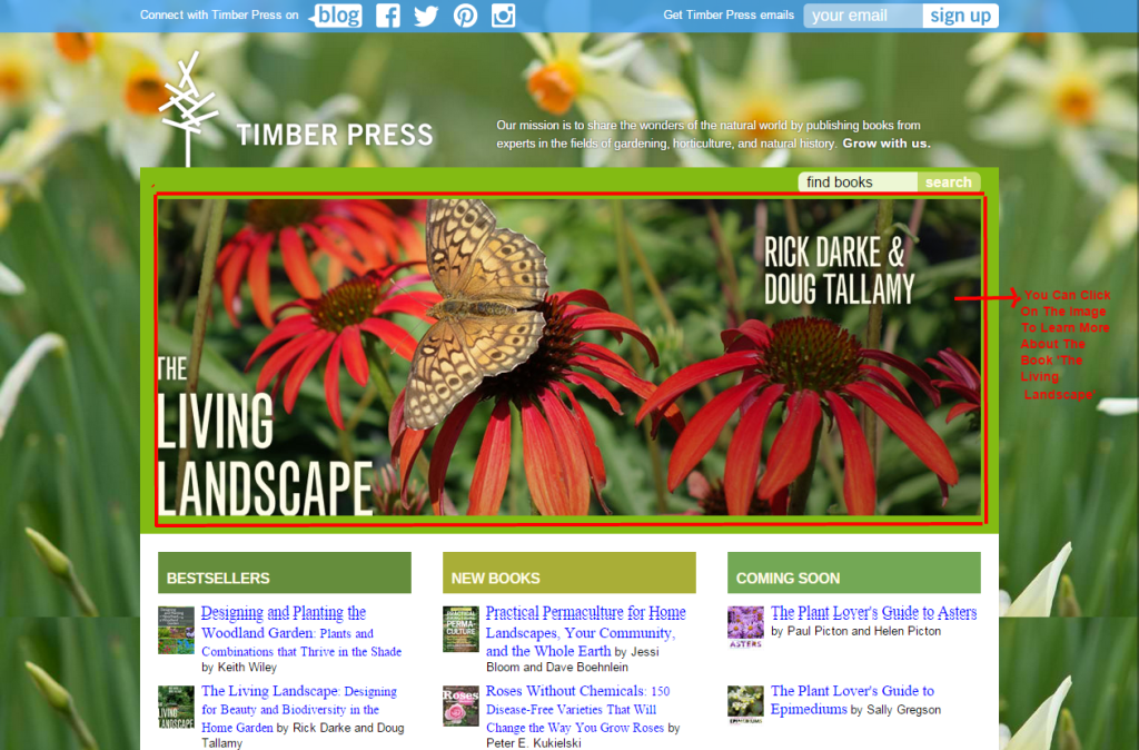
Take a look at how Timber Press demonstrates their latest book covers. This not only helps them to convey the right message but also keep their site updated and fresh.
#2 – Adding a Proper Product Description
As a web designer, you know must know by now that in ecommerce product description is necessary to make online shoppers get to know your product better. This influences the purchasing decision of the customer to some extent, since it fills up the void created because he/she is unable to touch the product in real. In an author’s or a publisher’s website, you can link your book up with a good book review. If you are not that good in writing a review, hire a copy writer to help you out on it with creating catchy headlines and a good body content. Your target audience can go through the review and then decide to click on the ‘buy’ button.
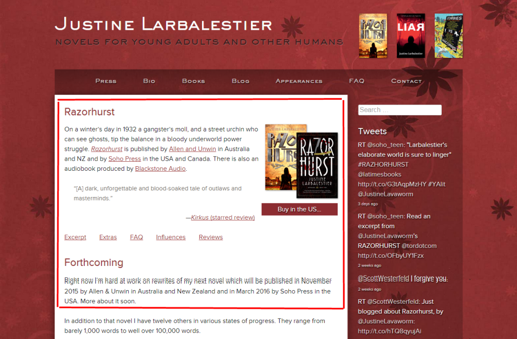
The website of Justine Larbalestier has a clean design layout with books displayed prominently on the home page. These books are linked up with blogs, interviews and other information on her latest works and events.
#3 – Bring Out a Perfect Color Communication
Colors are used to evoke a sense of mood in the minds of the people. Have you ever noticed why comic strips reveal professional expertise in the use of the right color palette? This is because colors help to communicate psychologically and emotionally. But going for the right color choice means you need to consider your goals too. What is it that you want to tell your customers? Do you want to sell your product or use the website for promotional purpose? Whatever it might be, your choice of colors should convey your sentiments for you – It should be approachable, strong and reliable but at the same time clean and clear.
Tell a story with your colors and it is not me alone who says it. Even Facebook for Business suggests it,
“A good story can break through geographic, linguistic, technological and even cultural boundaries…”
– Source
In an author or a publisher website, especially if you have a stock of fictional works to promote, colors should be able to extend a book’s visual tapestry. If as an author, your book is a fictional story set out during the time of autumn, then tinted or warm color shade is what you need to stir up the story around your book. The choice of colors you make must coexist carefully with the graphics and photos you use along with your brand image.
Your website’s aesthetic must be clean, simple as well as usable, irrespective of the color combination you implement.
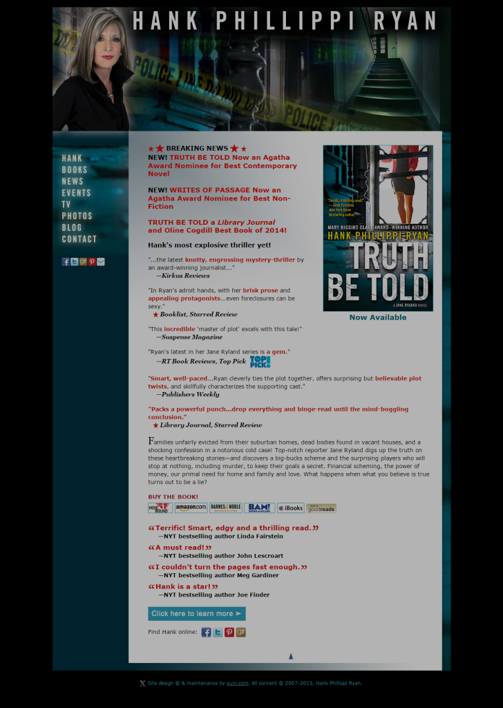
The website design of Hank Phillippi Ryan speaks a lot about the genre she writes in and matches with the cover and style of her books.
#4 – Make Your Intention Clear With a Call-To-Action
This goes for every website and an author’s or a publisher’s site is not an exception. A good web design can successfully communicate with your visitor, but what’s the next step? What do want them to do? This is where you need a specific Call-To-Action button.
Your CTA buttons should speak of actions like ‘Purchase Now’, ‘Subscribe Today’, ‘Sign Up’, etc. Every web page of your site must come with a Call-To-Action. Inserting too many CTAs on one page can often tend to confuse the visitor as to which action to take. It’s like putting too many choices on one plate and asking him/her to eat them simultaneously. You need to feed your customer step by step and therefore, it is preferable to dedicate one strong Call-To-Action to one page each. Readers would know what each page wants them to do. However, with mobile website being on the rise, most web designs now come with a single long web page instead of having separate page sections on a site. This is done keeping responsive web design in mind.
According to the latest internet marketing predictions, the number of internet users via mobile devices would rise from approximately 2 billion users to 2.7 billion this year in 2015. At the same time, the e-commerce business-to-community market is expected to rise to $1.2 billion from the previous market figure of $708 million. The current market scenario therefore makes it an obvious factor that going responsive is no more a choice, because half the world is now using mobile devices to access the web. Your website needs to be easily accessed with easy navigation features. While having separate page sections might often turn out to be annoying, especially if someone clicks on one navigation button and has to wait for minutes for the page to load completely. Therefore, in order to make one’s website easily navigable from a mobile device, most web designs now keep a single web page with repeated Call-To-Actions. This is because while scrolling down a lengthy page, a reader can forget what to do next. Repeated CTAs will remind him/her at every scroll what action they need to take. Whether it is the home page or the landing page, if your author or publisher website too follows this practice, ensure to prioritize the primary ones over others. You may use a bold font or a color contrast or even try to keep it above the fold. Your CTA needs to be loud and clear.
#5 – Subdividing Your Landing Page with Branch Classification
Consider the diagram of a plant. When a tree grows in height, it gives out branches and just like that you can create landing page classification for an author or publisher website.
A publisher website must consider having a separate landing page for all their best seller books. Or you can create separate landing pages to display your books based on different themes. For example, you may set up a separate landing page for your crime fiction genre. Link up each these collections to individual book pages that will again turn out to be landing page branches, where you can talk in detail about each of your books by providing book reviews, small excerpts, bio blurbs, audio clips or maybe testimonials from other authors. This will help readers get to learn a little bit about the plot of a particular book before they decide to add it to their shopping cart. Don’t forget to add a powerful CTA button on your landing page.
#6 – Social Media Integration for Better Audience Build Up
Facebook is set to dominate the social media market with having approximately 61% of the market share in terms of social logins. While this provides a good reason why you should focus more on Facebook social media marketing, try to stir up your interaction by sharing juicy tidbits. That is the biggest advantage of using Facebook, where you can easily share small and interesting information in chunks and get it liked, shared or discussed. No wonder how Facebook has stolen 40% of You Tube’s audience with one video where, according to reports from Business Insider, when UK’s major store John Lewis posted its Christmas ad on Facebook, it got shared 156,063 times. That was somewhat like 76.9 percent compared to You Tube’s 46,890 video shares.
According to market analysts and psychologist, people enjoy sharing posts that are educational, brief and humorous. But what I feel is that, people enjoy sharing posts that will help them to get a minute’s popularity with the number of times it would be shared and liked. Try understanding by putting you feet in the shoes of a Facebook user. You don’t just share out everything. On the contrary, you prefer sharing things that have valuable and striking information or something that communicates your philosophical thoughts. An organic content communicates better than a press release kind of page and Facebook is the best place to start out with.
#7 – Utilize Your Social Profile Display Image to Send Out Visual Vibes
My above point keeps its focus more on Facebook, but that does not mean leaving out the rest of the social media platforms from your list. Rather, a better and smarter option would be to integrate other social media platforms on a single platform and that single platform is none other than Facebook. But how, right? Well consider this example – Sharing a post on Twitter helps you get 30% audience attention and when you post this same tweet link on Facebook, you can earn as much as 80% audience attention.
We all know a picture can convey thousand words within a second compared to a text. If you have ever shared a tweet on your Facebook platform, you would notice your profile to appear along with your tweet accompanied with the following text – ‘Riya (for example) On Twitter’. Your display image can send out rapid vibes visually in less time. Try this out for yourself. This is because when sharing a post, it gets displayed on the newsfeed of people within your friend circle. They know you personally and have taken time to like, share and comment no matter what you have posted every time online. A Twitter post with the caption ‘Riya On Twitter’ is bound to arouse some curiosity with their mind. Don’t know whether it would be appropriate to say this, but it gives you an almost celebrity status. Trust me on that. I have experimented this on LinkedIn as well and have found my profile view statistics to elevate by percentage.
Therefore, according to my personal opinion, the best way to improve your social media marketing strategy this year is to interweave all your social media platforms under one big platform to watch the change.

- Meet Top 5 Indian Bloggers to Find Inspiration for Your Own Blogging Journey - July 30, 2019
- Why Use DRM Media Converter and Spotify Music Converter Only - May 24, 2019
- SendPulse – For Email Marketing Services with Atomic Results - November 8, 2017
User Review
( votes)Related Posts


About The Author
Riya Ghosh
Riya Ghosh is a content writer by profession and loves to stay up-to-date with the latest trends in web development and digital marketing. Apart from this, she enjoys writing crime fictions and dreams of setting her own publication house one day.